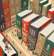
In Book Nooks (Chronicle, Sept.), design director Vanessa Dina and food and lifestyle associate editor Claire Gilhuly, both with Chronicle Books, share functional and aesthetic ideas for displaying books at home. The coauthors, who worked with photographer Antonis Achilleos on the project, spoke with PW about color organization, the importance of breathing room, and whether it’s okay to keep books in the bathroom.
How do each of you organize your books at home?
Gilhuly: We store books based on function and have books in almost every room. The biggest collection lives in built-in bookshelves in our family room, organized by each family member’s taste: my library of best-loved novels; my husband’s music books, record player, and record collection; and the bottom row of children’s books for our daughter. In my home office, I have an Alfred Newall bobbin bookshelf where I display books related to my work as an editor of cookbooks and lifestyle books. The shelf is behind my desk, so it’s a relevant Zoom background for work calls and a good conversation starter.
Dina: I live in a small apartment and I use every nook and cranny for book storage. In Book Nooks, we show books on a windowsill in a bathroom. My partner was like, nothing should be in the bathroom! But I kind of disagree. Organization by color helps. I have a bunch of Penguin Classics in a hutch in my living room. They’re tiny books and they all have orange spines, and I keep them in a stack. We’re also having fun with storing old paperbacks in our unused fireplace. Different spines facing out can look messy, so we flipped them around. Old paperbacks often have colored edges, and you can design with those books in an abstract way, making patterns, zigzags, or color blocks. I’ve read them and I’m probably not going to read them again, so they’ve become a design element.
What displays have stood out to you?
Gilhuly: One of my favorite ideas, which I saw in a bar years ago, is using vintage cookbook pages as wallpaper or framing them as art; in our book we refer to the idea in a kitchen hutch display where a page from a vintage cookbook is taped to the cabinet wall. And because I love a traditional library aesthetic, the most iconic space in my mind is the library of Trinity College in Dublin, Ireland—it looks straight out of Hogwarts.
Dina: We found this online and it’s featured in the book—an armoire that’s been converted into a children’s reading space. They put in a shelf and a little seating spot for a small child, and I thought that was really inspiring.
What should people keep in mind when showcasing their books?
Gilhuly: It’s challenging to land on the right ratio of “books to decor objects” on a shelf. The most eye-catching book displays aren’t overcrowded with books. They have plenty of objets d’art and curiosities, and enough empty space to allow for some visual breathing room. If something looks off with your bookshelves, it’s probably related to this ratio.
Dina: If you’re fortunate enough to create a specific location for books, like built-in shelves, that’s awesome. But if you’re in a smaller and tighter space, it helps to think about the unexpected: a bar cart, a side table. And obviously, easy access is important. If I’m going to use a cookbook every day, I want it right there on my kitchen shelf.


